Companies wanted an engaging way to measure employee wellbeing
Project overview
NewU sells wellness programs to companies. Those companies pay good money. They want proof it's working ; health scores, participation trends, department breakdowns.
But the data comes from employees. And employees have one question before they answer anything honest: who's going to see this?
Company: NewU · Dutch health tech · B2B employee wellness platform
Scope: Full feature - admin survey builder, employee survey experience, results dashboards, health report cards, department segmentation, multilingual support
My role: Lead product designer - research, interaction design, UI, testing
Two users. Opposite instincts. One product.
This wasn't a single-user feature. I was designing for two audiences who want conflicting things from the same system.
HR managers (web dashboard) need to create surveys, target departments, schedule quarterly check-ins, and read aggregate results. They want granularity "show me how the sales team's stress compares to engineering." They want data rich enough to justify their wellness budget.
Employees (mobile app) need to answer sensitive health questions about sleep, stress, smoking, exercise, burnout, and workload. They want to know their answers won't follow them into a performance review.
The product challenge: give employers meaningful data without ever making employees regret being honest.
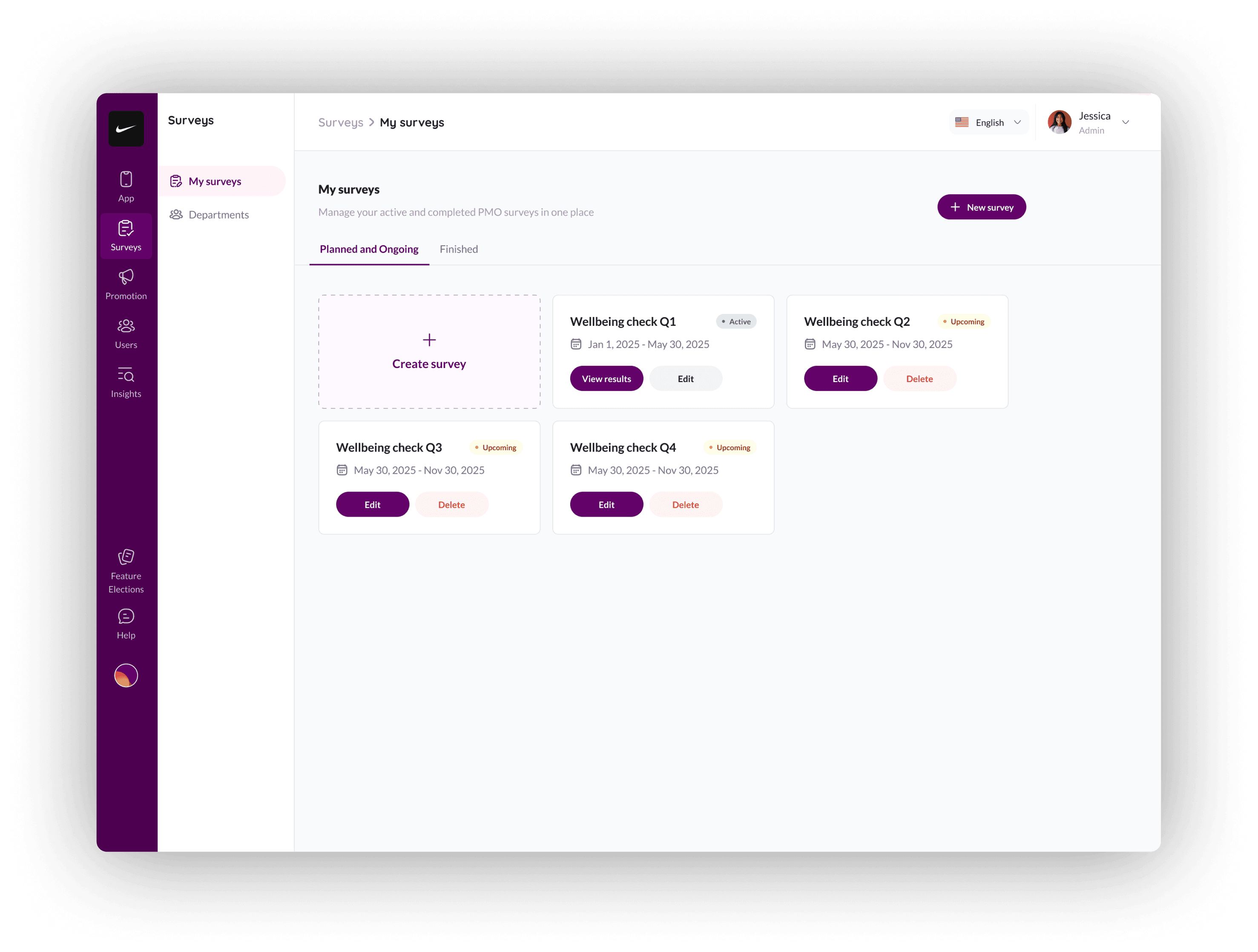
I started with the admin side: what does "create a survey" actually mean?
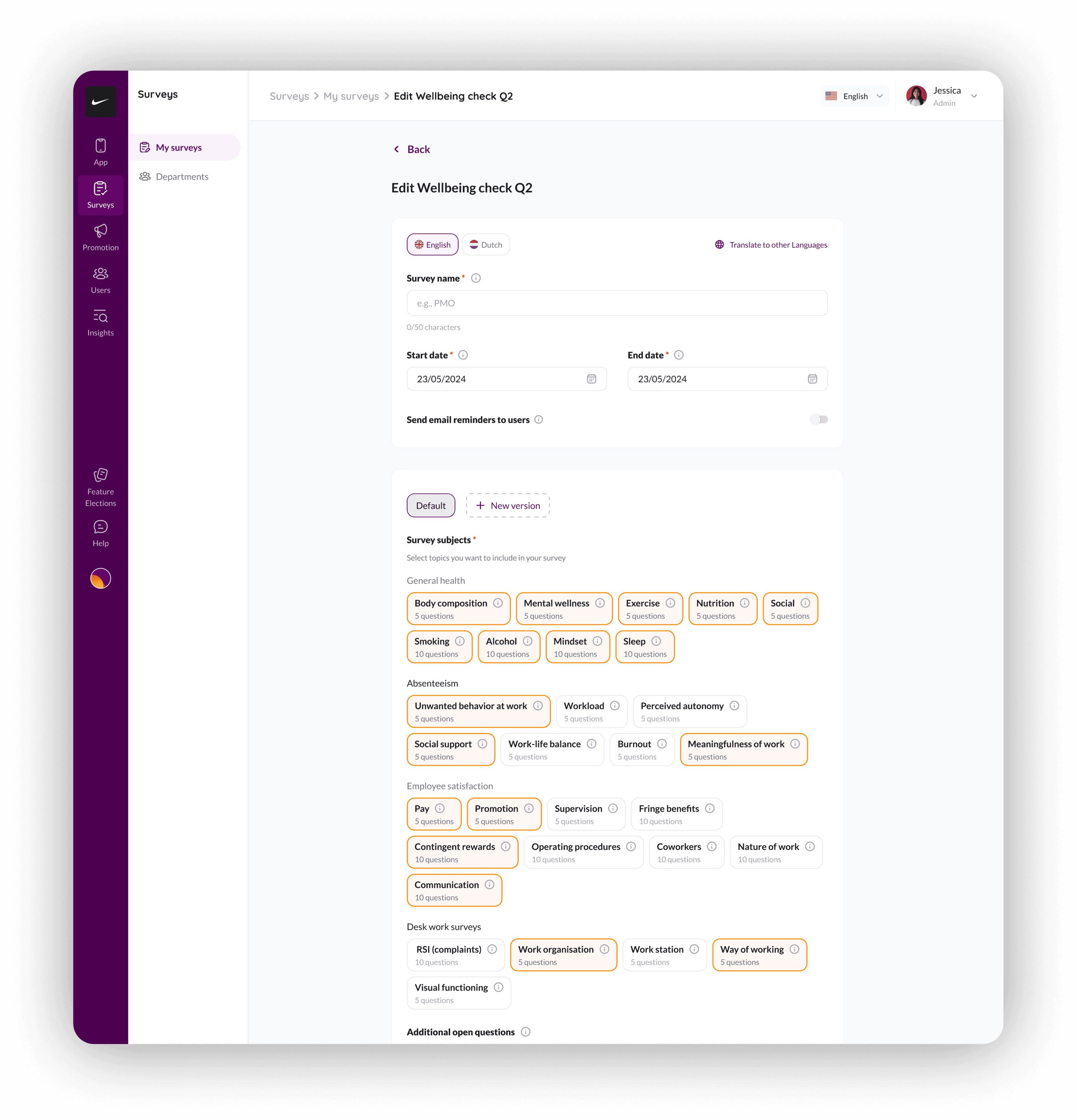
NewU's research covers 25+ validated survey instruments across five domains. Each instrument has its own methodology — the Pittsburgh Sleep Quality Index, the Job Satisfaction Survey, the RSI complaints assessment. Some have 5 questions. Some have 10.
The design decision: I built a topic-picker, not a questionnaire builder. Admins select domains: General Health, Absenteeism, Desk Work, Employee Satisfaction; and the validated instruments come pre-loaded. Each topic pill shows the question count adn question preview upfront.
The mobile experience had to make surveys feel worth taking
This was the hardest part of the project. Employees don't wake up excited to fill out workplace health surveys. The previous manual process had low response rates because the experience felt clinical, long, and pointless.
I needed to solve three problems on mobile:
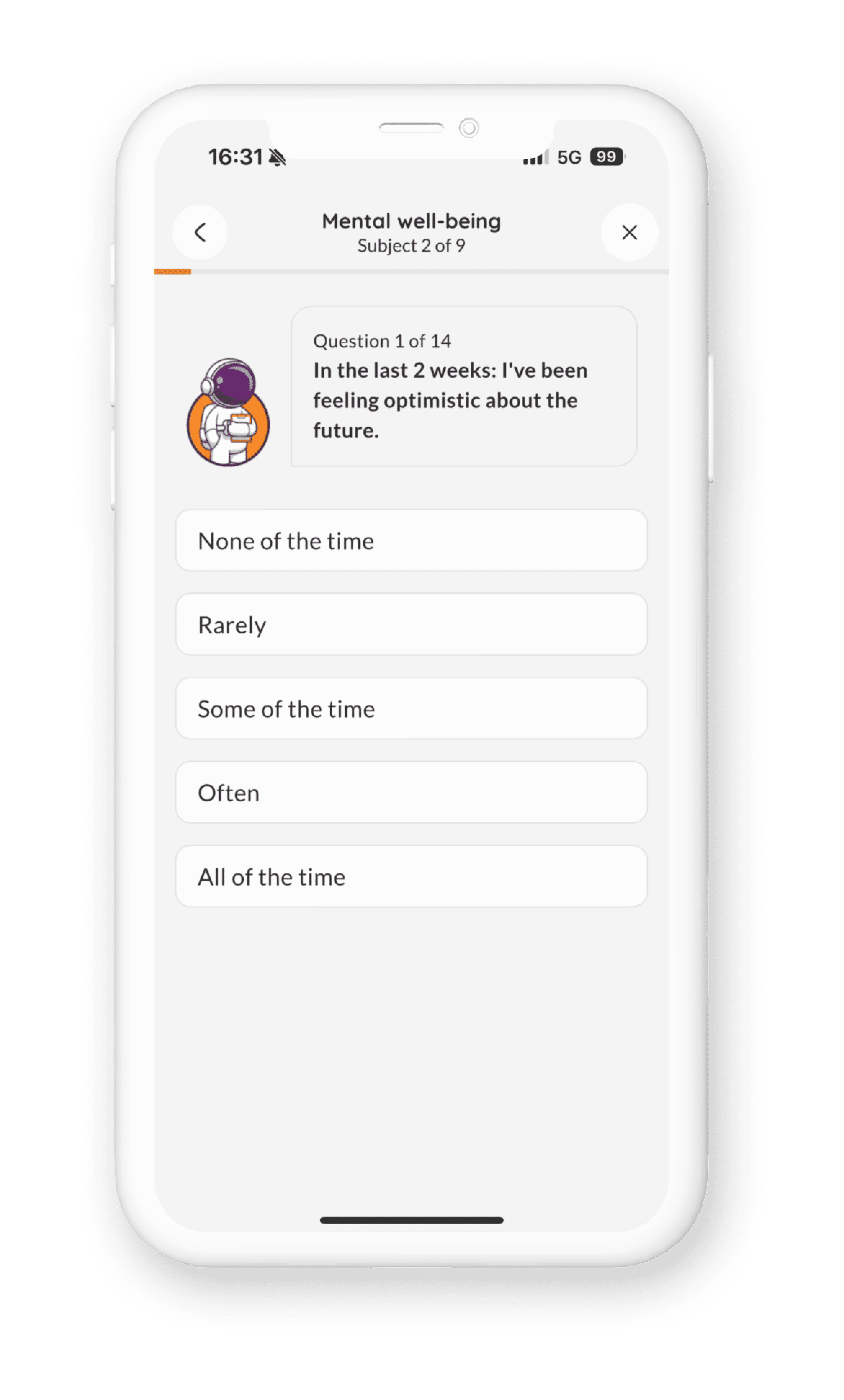
Problem 1: Surveys felt endless. Some assessments have 17 questions across multiple subjects. A flat list of radio buttons kills motivation by question 4.
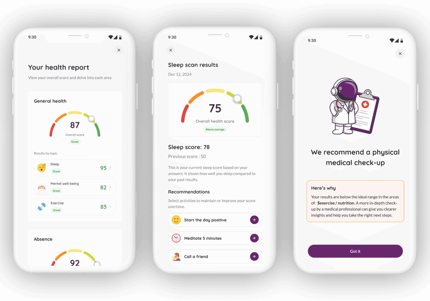
My approach: I broke surveys into subject chunks with clear progress indicators. "Subject 1 of 1. Question 5 of 17." The astronaut character (NewU's brand mascot) sits beside each question . It makes a medical questionnaire feel like a conversation instead of a form.
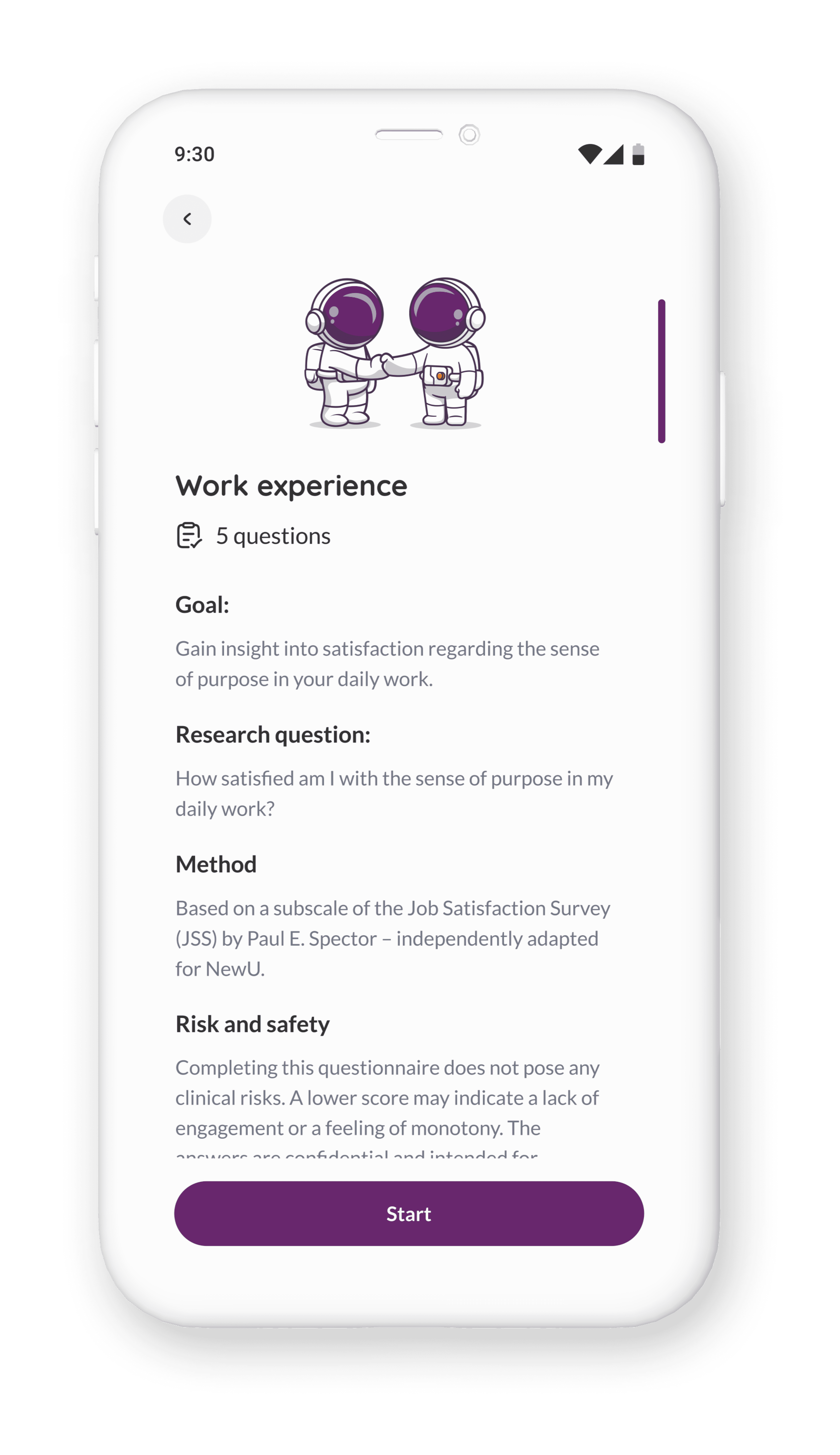
Problem 2: Employees didn't know why they should care. Taking a survey with no visible payoff teaches people not to take the next one.
My approach: Before each survey topic, employees see a detail screen explaining what the research measures, why it matters, and what kind of results they'll get back. The sleep scan explains it uses the Pittsburgh Sleep Quality Index. It names the research question. It describes possible findings in plain language. It even addresses risk and safety
Problem 3: Results needed to feel personal and actionable. A score of 72 means nothing without context.
I designed a health report card that gives employees their scores across every domain — General Health, Absenteeism, Desk Work, Employee Satisfaction — with colour-coded ratings (Great, Good, Mixed, Not Healthy, Needs Improvement).
The sleep results screen, for example, shows the overall score, compares it to the previous score, explains what the number means in plain English, and suggests relevant activities that are linked to NewU's activity library so users can add them directly.
If scores fall below a safe threshold, the app recommends a physical medical check-up. Not buried in fine print. A full-screen message with the astronaut in a doctor's coat, explaining why.
The admin results dashboard had to be dense without being overwhelming
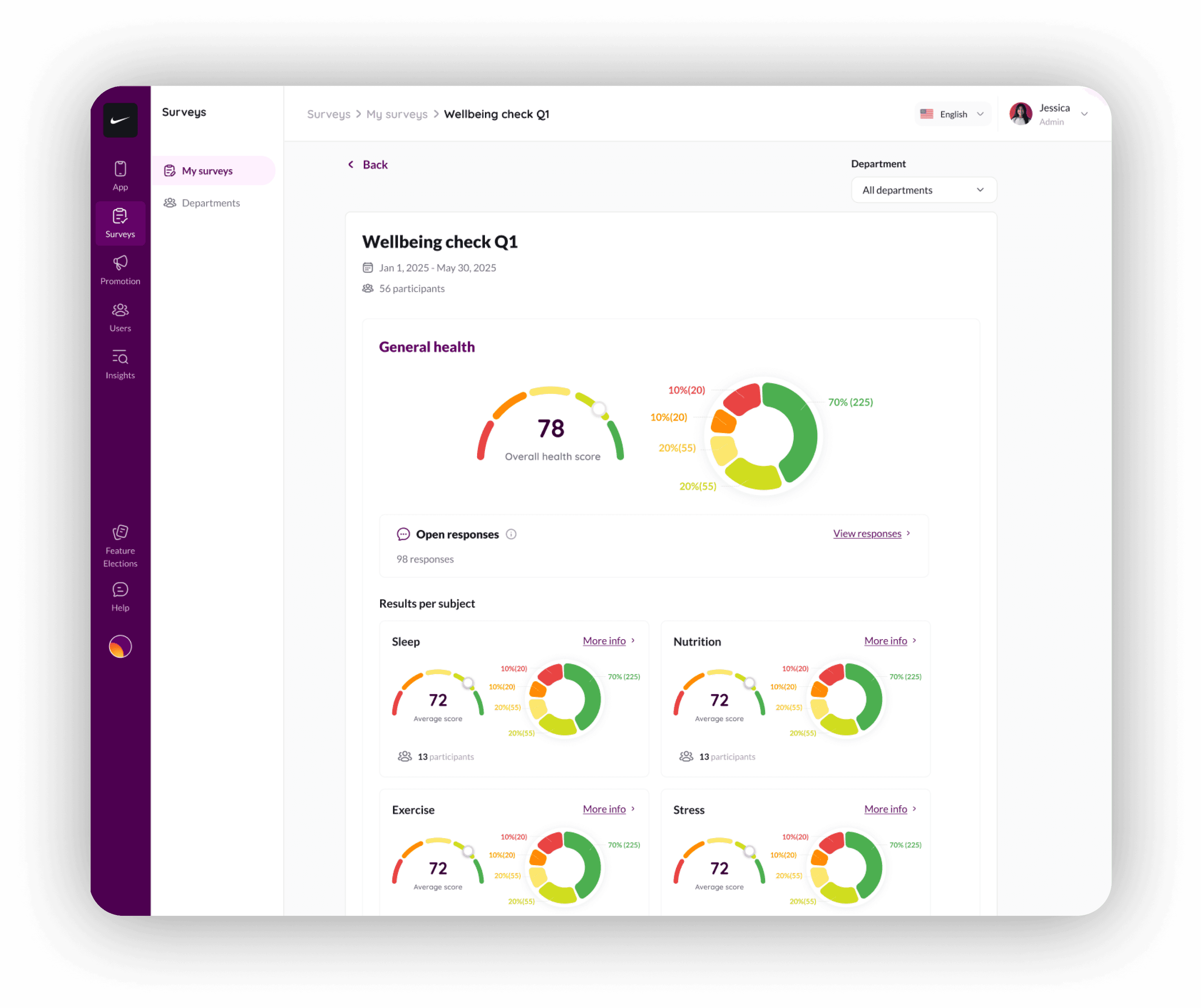
HR managers viewing results need to absorb a lot: overall health scores, distribution breakdowns, per-subject scores, participant counts, department filters — all for potentially dozens of survey topics.
I structured the results page as a vertical scroll through domains — General Health first, then Absenteeism, Desk Work, Employee Satisfaction. Each domain shows an overall score (gauge chart), a distribution donut (traffic-light colour coding showing what percentage of employees fall in each range), and expandable per-subject scores.
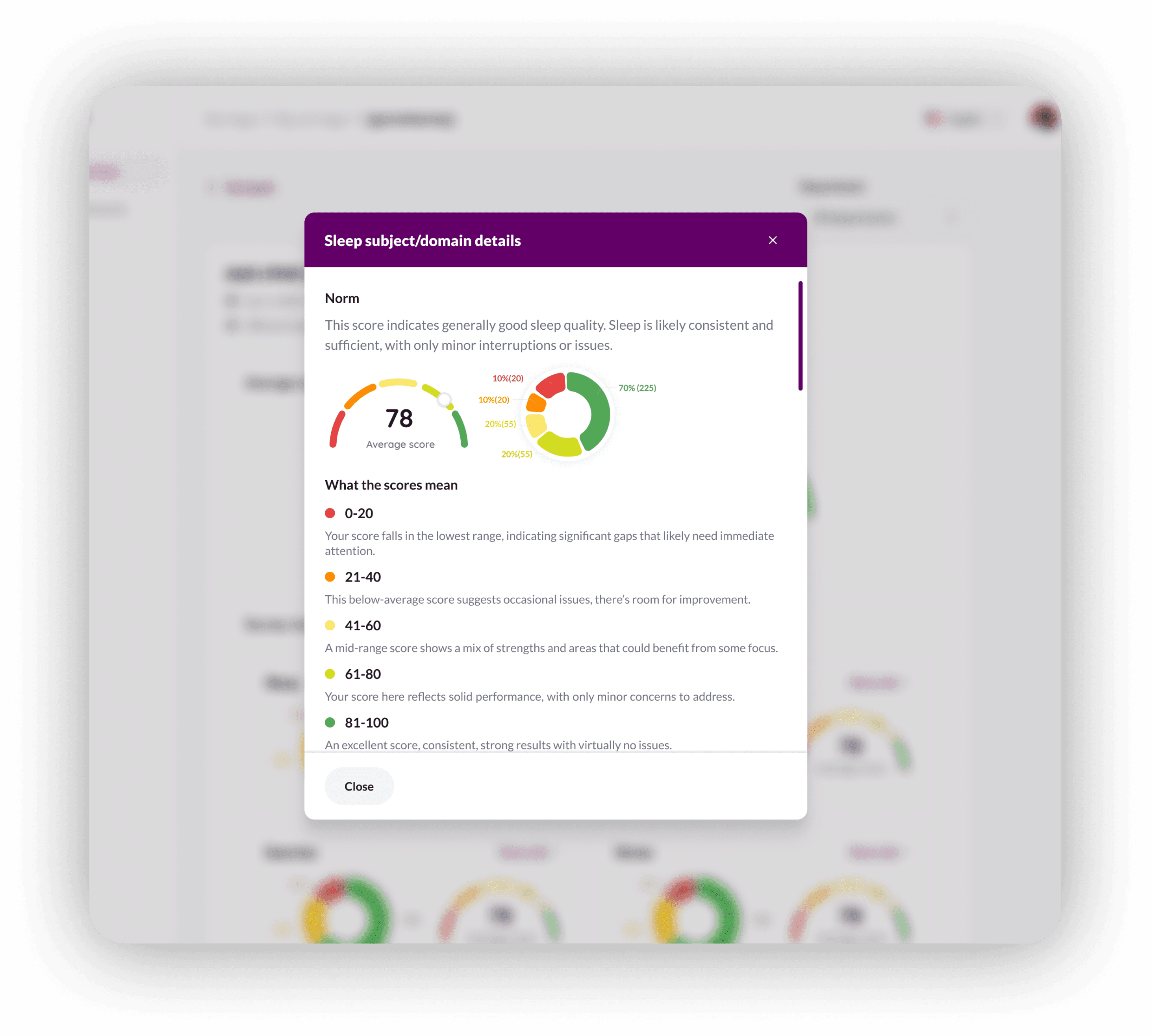
The "More info" links on each subject open a modal with the full research context — the norm interpretation, score ranges explained, methodology, origin
This serves two audiences at once: HR managers who just want the headline number, and workplace health consultants who need the research rigour behind it.
Accessibility and multilingual support were also tricky
The surveys needed to work across screen sizes — including older Android devices common in warehouse and factory settings. I tested layouts against varying content lengths (Dutch text runs ~30% longer than English) and ensured touch targets met accessibility standards.
The survey builder supports English, Dutch, and additional languages. This mattered because NewU's clients operate across the Netherlands and Belgium — employees answer in their preferred language, but HR managers review results in theirs.
What I'd change if I started over
I'd design the "Quick Health Scan" flow first, not last. We added a standalone health scan separate from HR-scheduled surveys — so employees can check their scores anytime. It works, but it was bolted on after the main feature. If I'd designed both flows together from the start, the information architecture would be tighter.
I'd push for longitudinal result views earlier. Right now, employees see their current score and previous score. I want to show a 4-quarter trend line — "your sleep score over the past year." That visual alone would make repeat participation feel worthwhile.
I'd co-design the admin results page with an actual occupational health consultant. I worked from requirements and research, but sitting with someone who interprets this data professionally would have sharpened the information hierarchy.