Every component in our product referenced a different source of truth (Design system)
Project overview
NewU's UI had a colour problem. Not an ugly-colours problem. A who-decides-what-purple-means problem.
Buttons used one blue. Links used another. Both were supposed to be the same. Neither referenced a shared system. Dark mode was a manual repaint. Brand theming for client white-labelling was a guessing game. Every new feature meant re-answering the same question: what colour should this be?
Company: NewU · Dutch health tech · B2B employee wellness platform
Timeline: 4 weeks, October 2025
My role: Lead Product Designer & Art Director - Audit, architecture, token design, documentation
Scope: Complete colour token rebuild — primitives, semantic roles, component aliases, light/dark modes
Team: Emmanuel Job, Nkiru (Design), Development team
What "inconsistent" actually looked like in practice
The word "inconsistent" undersells it. Here's what was actually happening:
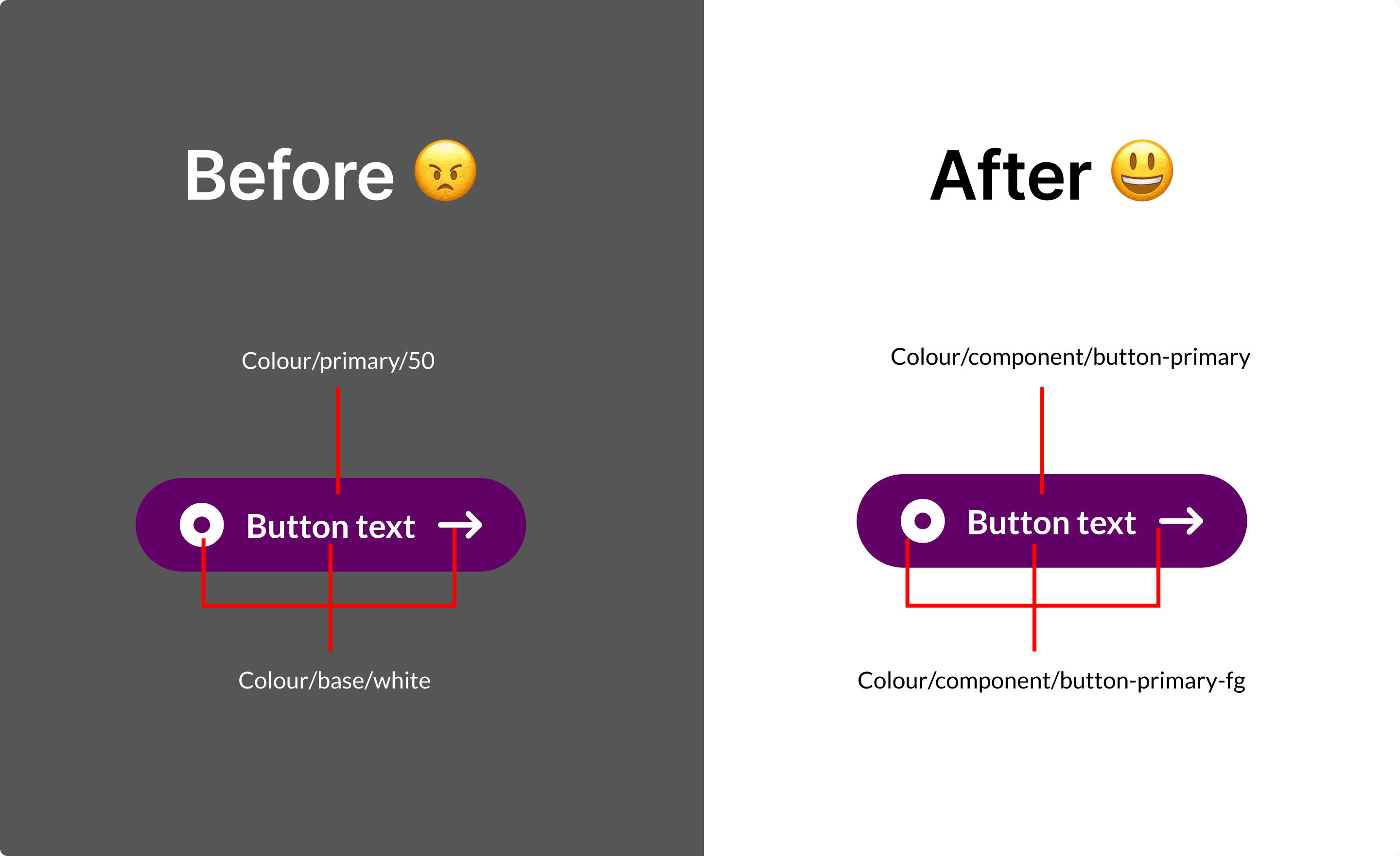
Components referenced primitive values directly. A button's background was
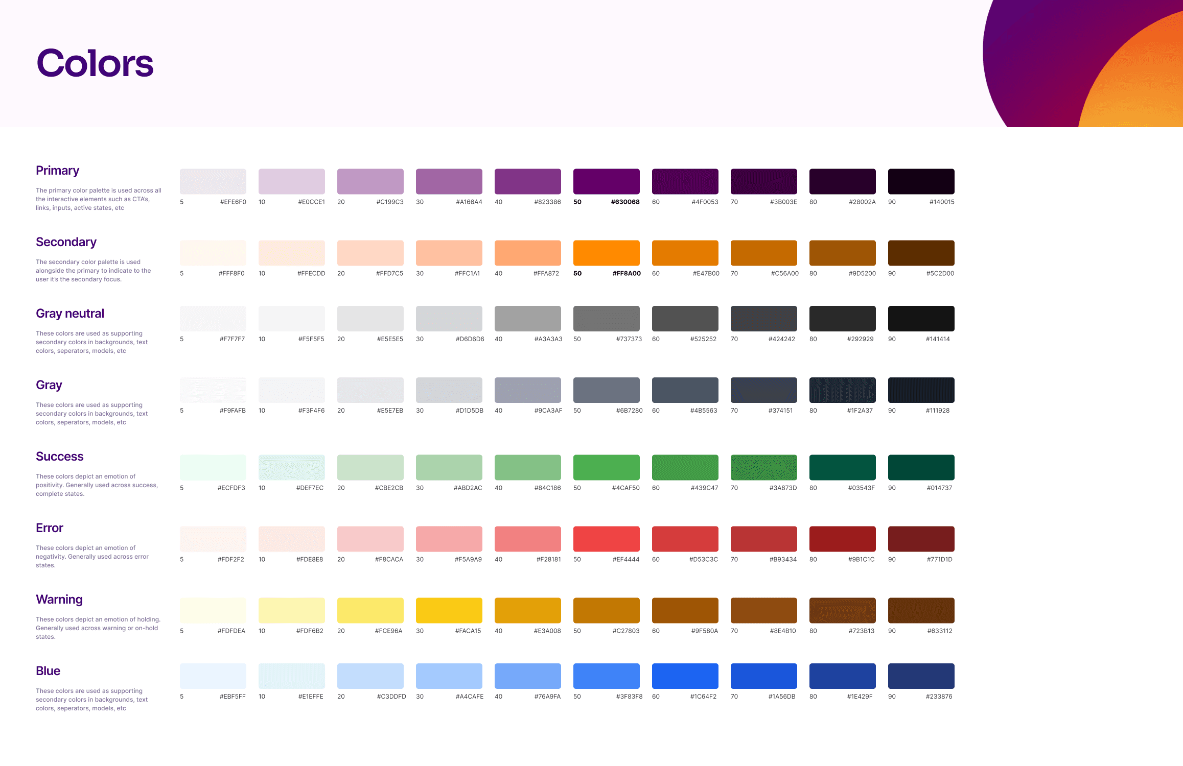
blue-500. Not "action-primary" — the literal hex ramp value.Colour ramps weren't normalised. Our grey scale had uneven perceptual steps. The brand blue ramp had gaps. Designers eyeballed values. Developers hardcoded them.
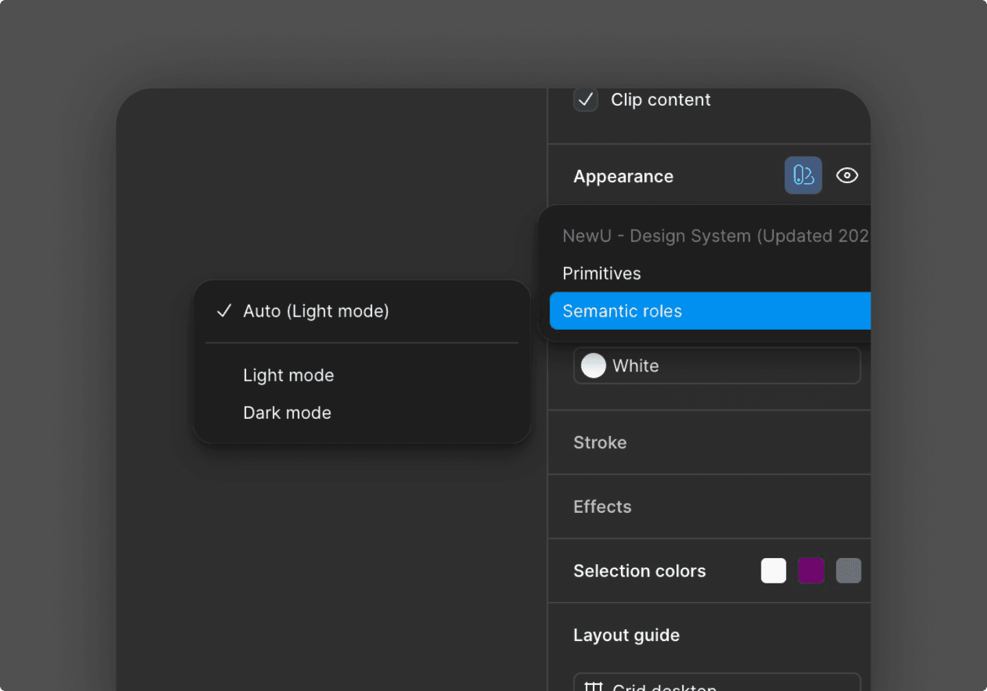
Dark mode was a repaint, not a theme. Every time we needed dark mode, someone manually swapped colours. No mirroring. No token aliasing. Just a person going screen by screen, picking darker versions of each colour.
Brand theming for client companies was impossible. NewU wanted to offer custom branding for clients; their logo, their colours in the app. Without semantic tokens, changing a brand colour meant touching dozens of components by hand.

Old colour ramps 1.1
I started by auditing everything we had, then built a three-layer architecture
The audit. I catalogued every colour value used across the product — in Figma and in code mainly. I evaluated two approaches:
Option A: A flat token system — one layer of named colours mapping to values. Simpler. Faster to build. But it wouldn't support theming or dark mode without duplication.
Option B: A three-layer system — Primitives → Semantic Roles → Component Aliases. More complex upfront. But it would make dark mode automatic, brand theming trivial, and future design decisions consistent by default.
I chose Option B. The upfront cost was worth the long-term payoff. Here's how each layer works:
Primitives are the raw colour ramps. Blue-50 through Blue-900. Grey-50 through Grey-900. No meaning attached — just the palette. I normalised every ramp to have perceptually even steps.
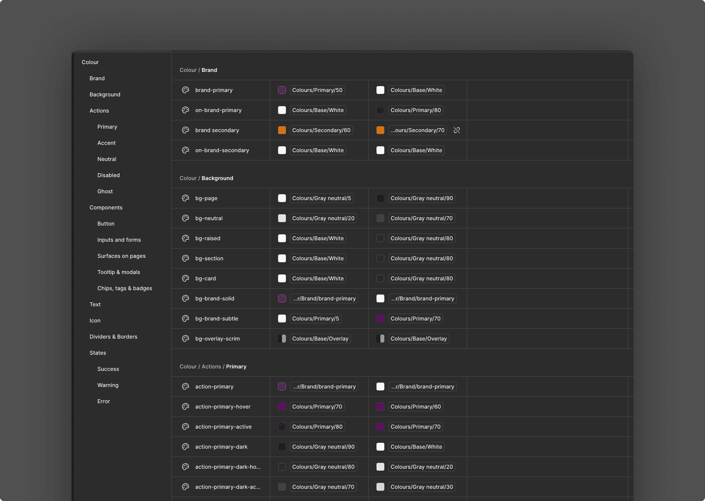
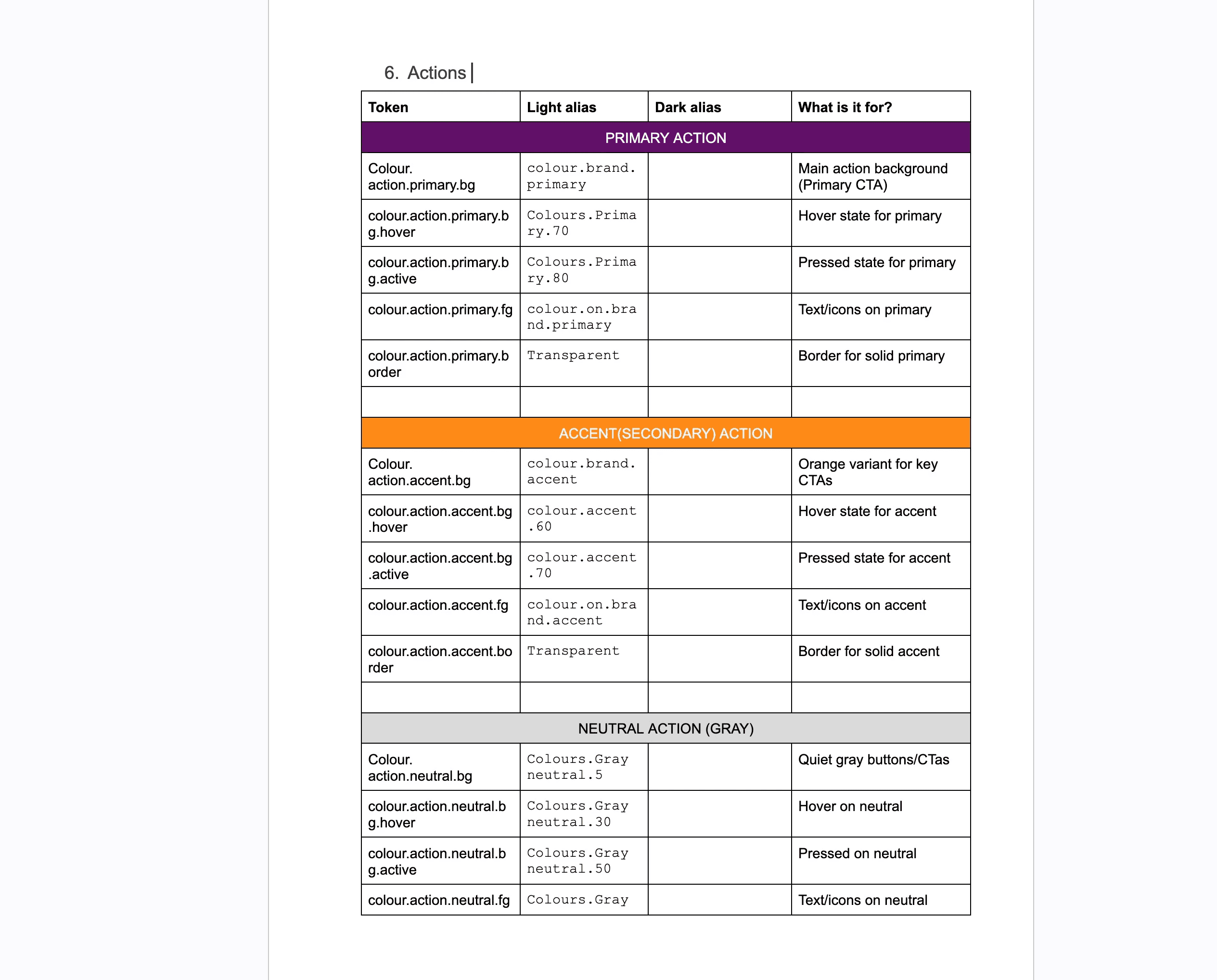
Semantic Roles assign meaning.
action-primarypoints toblue-600in light mode andblue-400in dark mode.foreground-defaultpoints togrey-900in light mode andgrey-100in dark mode. The names describe what the colour does, not what it looks like.Component Aliases connect components to roles. A button's background references
action-primary. A card's border referencesborder-subtle. Components never touch primitives.
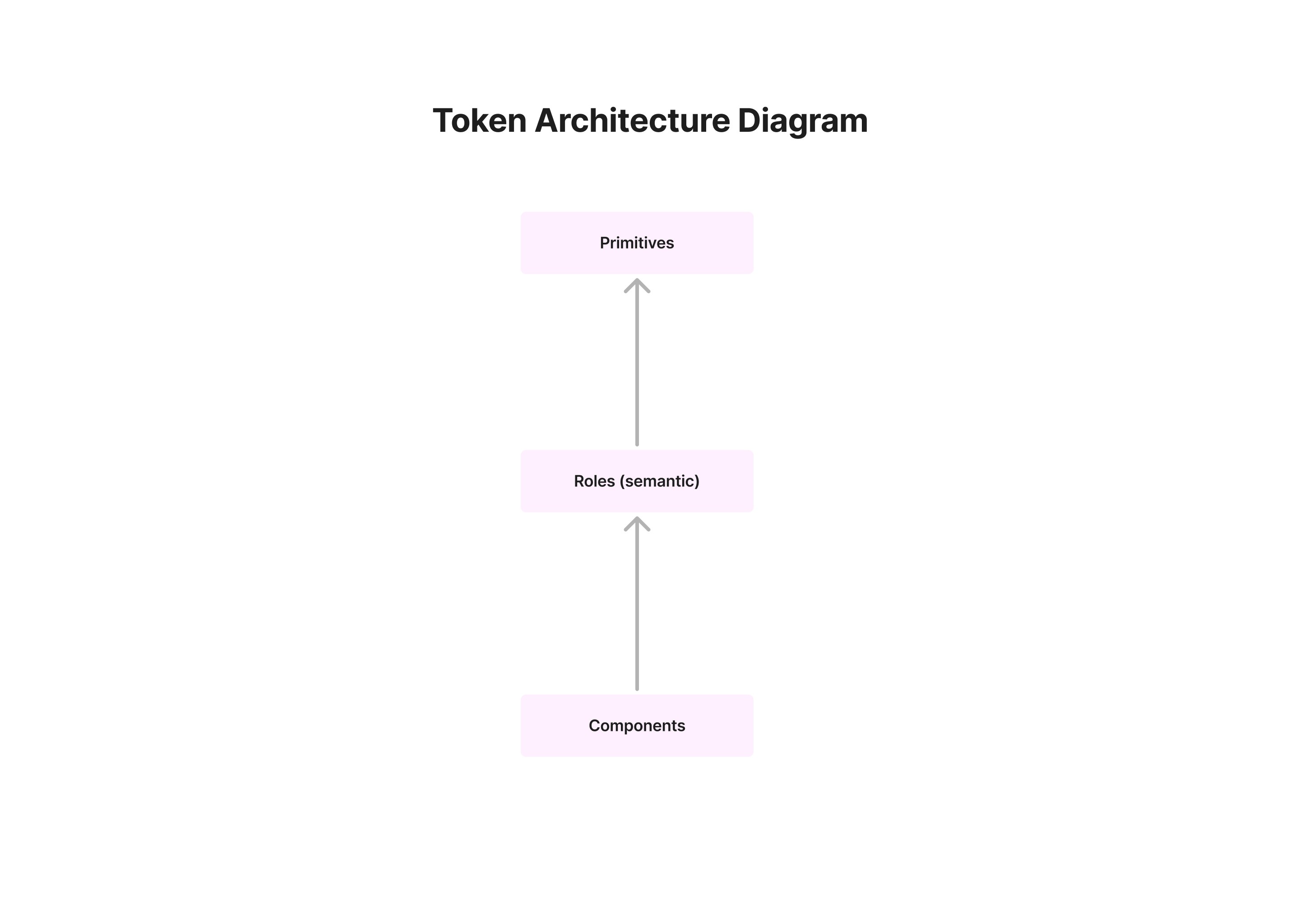
Simple token architecture diagram 2.0
Dark mode went from days of manual work to a toggle
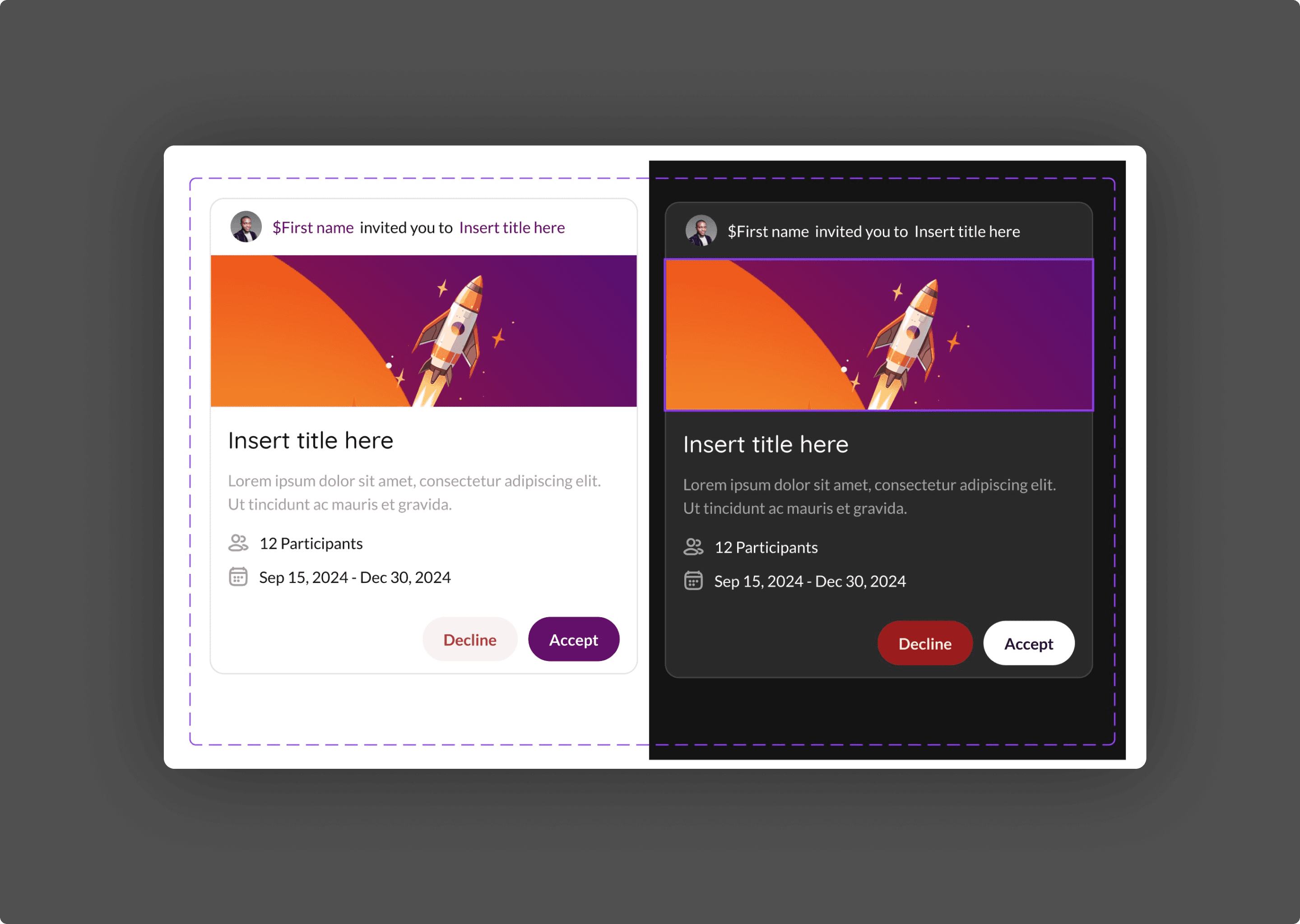
The payoff of three layers: dark mode required zero new names. Light mode maps action-primary to purple-600. Dark mode maps it to purple-400. Same semantic name. Different primitive value. Every component that references action-primary adapts automatically.
Four weeks from audit to shipped documentation
A focused, repeatable cadence over 4 weeks.
Week 1: Audit colour usage, list primitives in use, define naming rules
Week 2: Build variables (primitives), create roles, map all core components
Week 3: Dark aliases, action families, migrate remaining components
Week 4 +: QA pass (contrast, leaks), docs, library clean-up and attaching aliases to recent project files.
The hardest week was Week 2. Naming is deceptively difficult. foreground-default vs. text-primary. surface-subtle vs. background-secondary. Every name needed to be intuitive to designers, unambiguous to developers, and scalable for future additions.
Before: hard-coded hex, uneven ramps, manual dark/custom theme edits
After: token-first system, normalised ramps, light/dark parity, faster theming
The design system now supports theming, dark mode, and client branding from one source of truth
One thing I underestimated: the documentation was as important as the system itself. A perfectly designed token architecture is useless if the team doesn't understand it. I spent more time on the reference tables and migration guide than I initially planned
What I'd do differently next time
I'd also plan for the token system to extend beyond colour. Spacing, typography, and elevation tokens would make the design system fully semantic. Colour was the most urgent problem, but the architecture pattern applies to everything.