HR managers couldn't schedule a wellness challenge without calling us
Project overview
NewU sells vitality programs to companies. The platform works when employees participate. Employees participate when HR managers schedule events. And HR managers had stopped scheduling events.
Not because they didn't want to. Because the tool made it miserable.
Company: NewU · Dutch health tech · B2B employee wellness platform
My role: Lead product designer - research, interaction design, UI, testing
Outcome:
2-click scheduling.
Active users up 155% in six months
Challenges completed up 745% in six months
Why the old scheduler blocked adoption
NewU's scheduling system had grown organically. Features got added. Nobody pruned. By the time I joined the project, HR managers faced three separate tabs to do one job: schedule a wellness initiative. This led to a fragmented and confusing experience for HR managers.
Redundant and overlapping scheduling tabs (Timeline, Roadmap, Collaborations)
Ambiguous terminology that confused users
Complex flows that forced HR managers to rely on NewU staff for setup
No autonomy for organizations to manage initiatives independently

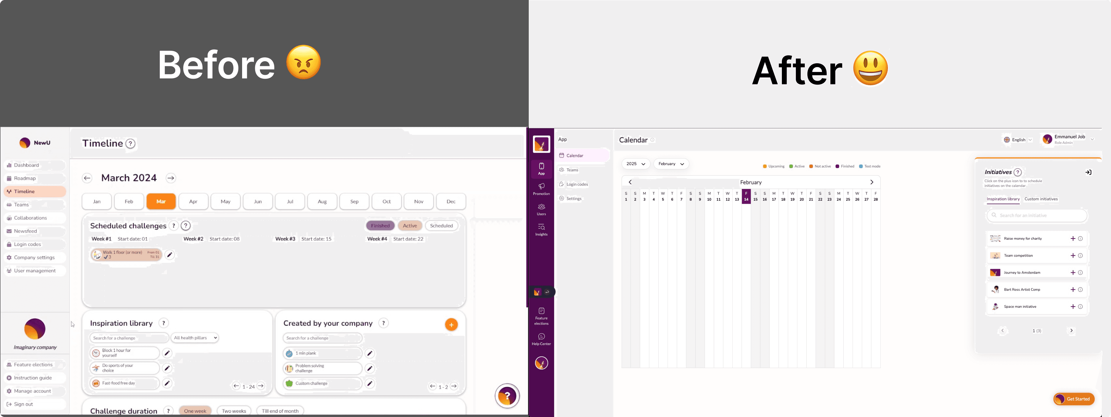
Three pages trying to do one job(old design) 1.1
I mapped every path an HR manager takes, then eliminated most of them
Before touching the UI, I needed to understand the full picture. I did two things in parallel:
Usability test: We ran usability tests with five HR managers. Three couldn't complete a scheduling task without help. One described the experience: "I know the feature exists, I just can't find it."
Key user pain points:
Complex navigation, unable to identify where to go to perform simple actions.
Confusion caused by unclear terminologies.
Frustration due to the inability to manage scheduling independently.
Competitor analysis across five employee wellness platforms. I looked at how Yumuuv, Culture Amp, even google calendar handled event scheduling. The best ones had one view. A calendar.
The insight was simple: HR managers think in calendar time. They want to see Monday, pick a slot, assign a challenge. Three tabs fractured that mental model into pieces.
We set a simple goal: schedule in two clicks
I combined the timeline, roadmap, and collaborations into a single calendar view. Every wellness initiative , whether it's a walking challenge, a mental health week, or a team competition — lives on one screen.
The design decisions that mattered most:
Everything is an event on a calendar. No more distinguishing between "initiatives" and "collaborations" in the navigation.
Two clicks to schedule. Click a date. Select an initiative from a pre-built library. Done.
Labels replaced jargon. "Collaboration" became "Team Competition." "Initiative" got a visible icon system so types are distinguishable at a glance without reading.
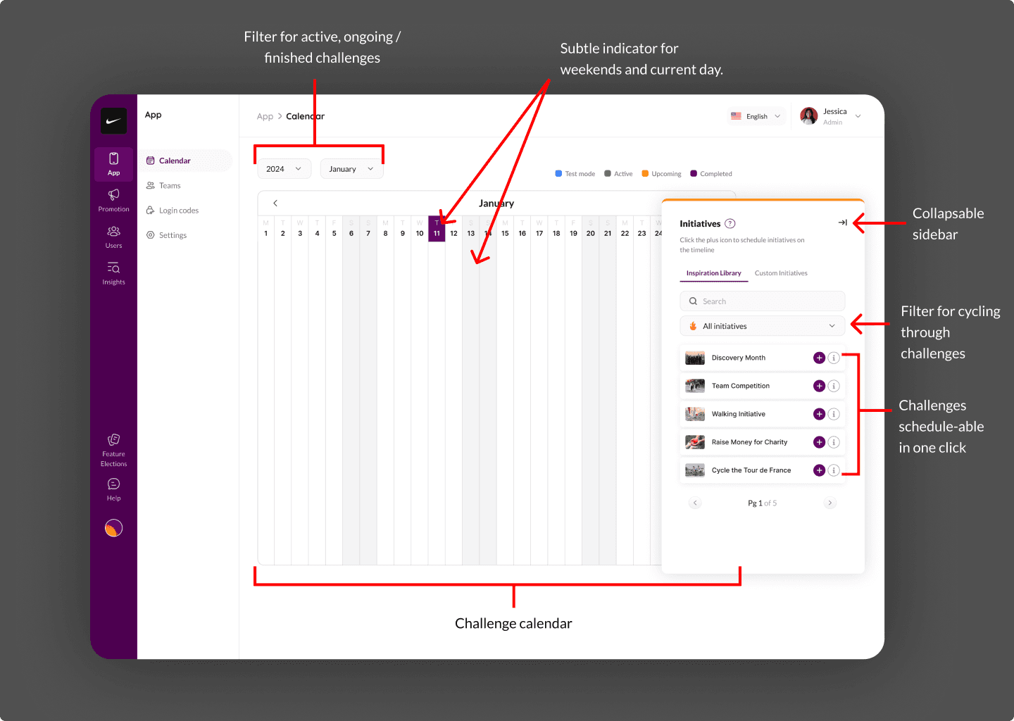
One tradeoff I want to be honest about: collapsing three tabs into one meant the calendar view carries more density. Power users at companies with 50+ scheduled events per quarter could feel crowded. We addressed this with filters and a collapsible sidebar, but it's a tension I'd revisit with more data.
155% more active users.
After launch, the metrics moved fast:
Scheduling dropped to 2 clicks from an average of 9 actions across multiple screens.
Active users increased 155% quarter-over-quarter. HR managers who had gone dormant came back because scheduling finally worked.
Activities completed jumped 745%. This was the downstream effect — when HR managers schedule more, employees participate more.
The 745% number looks dramatic. Context matters: the baseline was low because the old system suppressed scheduling activity. The percentage is real, but the story behind it is more important than the multiplier. We removed a bottleneck that had been quietly strangling product adoption.
What this project changed about how I think
I came into this project assuming I'd be redesigning a UI. The real work was rethinking information architecture.
If I did this again, I'd push harder to interview end employees (the people doing the challenges), not just HR managers. We optimised for the scheduler's experience, but I suspect there are downstream UX improvements in how employees discover and join events that we haven't explored.
I'd also build in analytics instrumentation from day one. We measured outcomes after launch, but I wish I'd had richer baseline data to make the before/after comparison sharper.

