NewU Design System: How I Transformed Chaos into Consistency
As NewU expanded, inconsistencies in the brand style across the mobile app and web portal became evident. Variations in colours, typography, assets, and component styling led to inefficiencies in both design and development. To address these challenges, I independently created a comprehensive NewU Design System to streamline UI consistency, improve scalability, and enhance collaboration between designers and developers.
Category
Case study
Company
NewU
Industry
B2B
Year
2024
Role
Lead designer
Core Elements
The design system covered the following foundational elements:
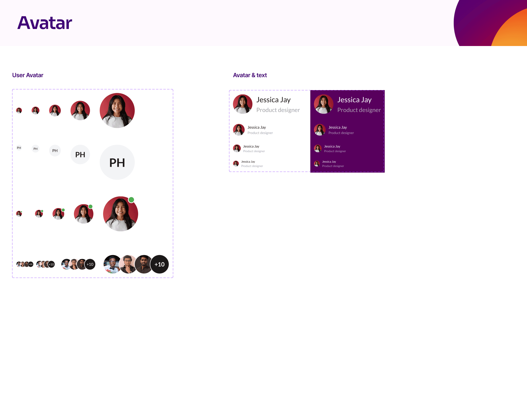
Brand Assets: Logos, icons, illustrations, avatars.
Styles: Colors, typography, shadows, and borders.
Components:
UI Elements: Buttons, forms, inputs, tables, cards, alerts, modals.
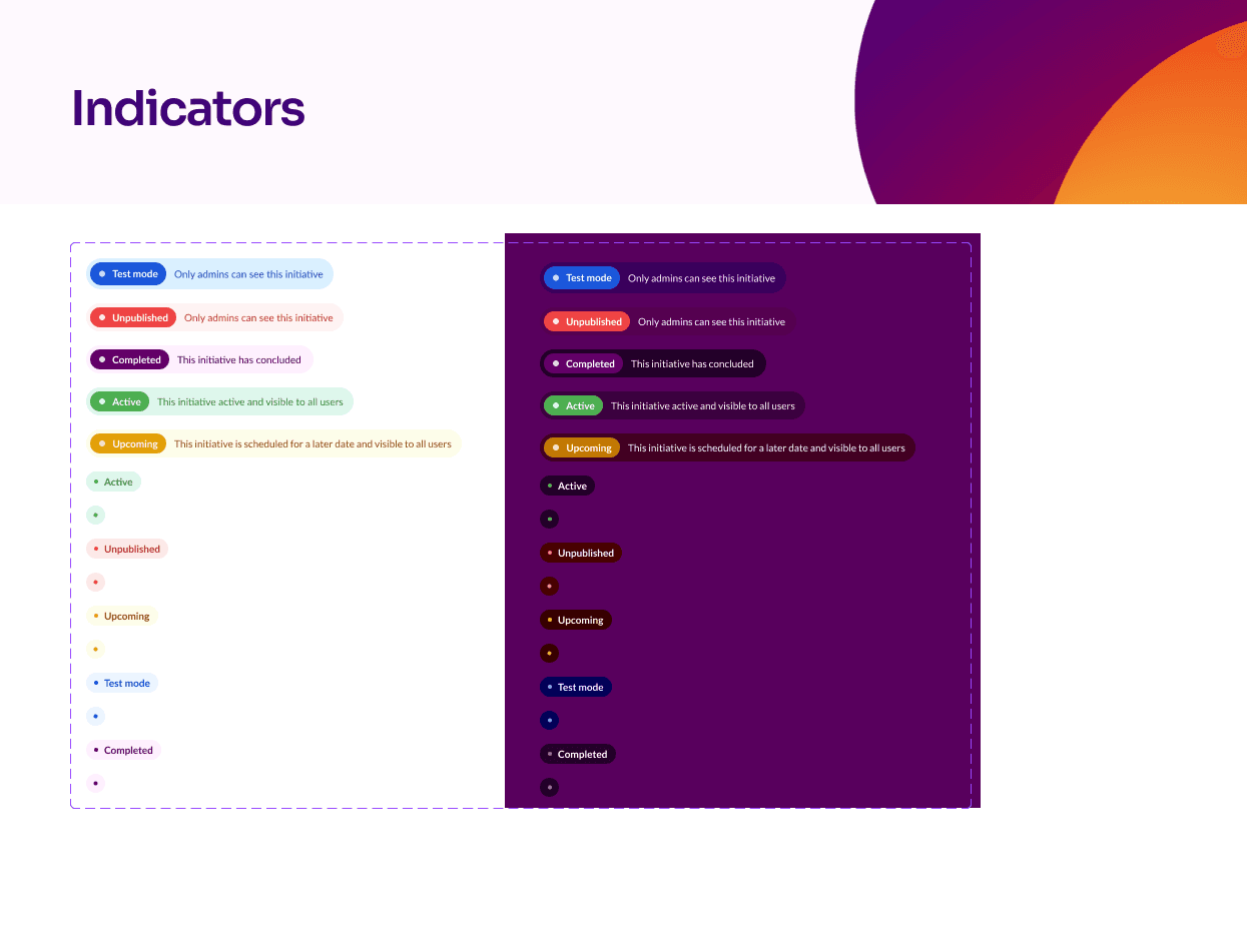
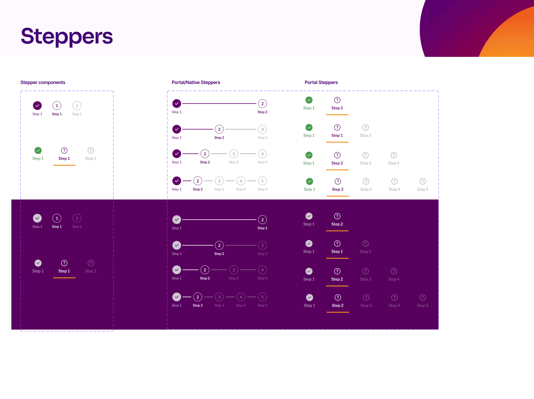
Navigation & Feedback: Steppers, tooltips, indicators, banners.
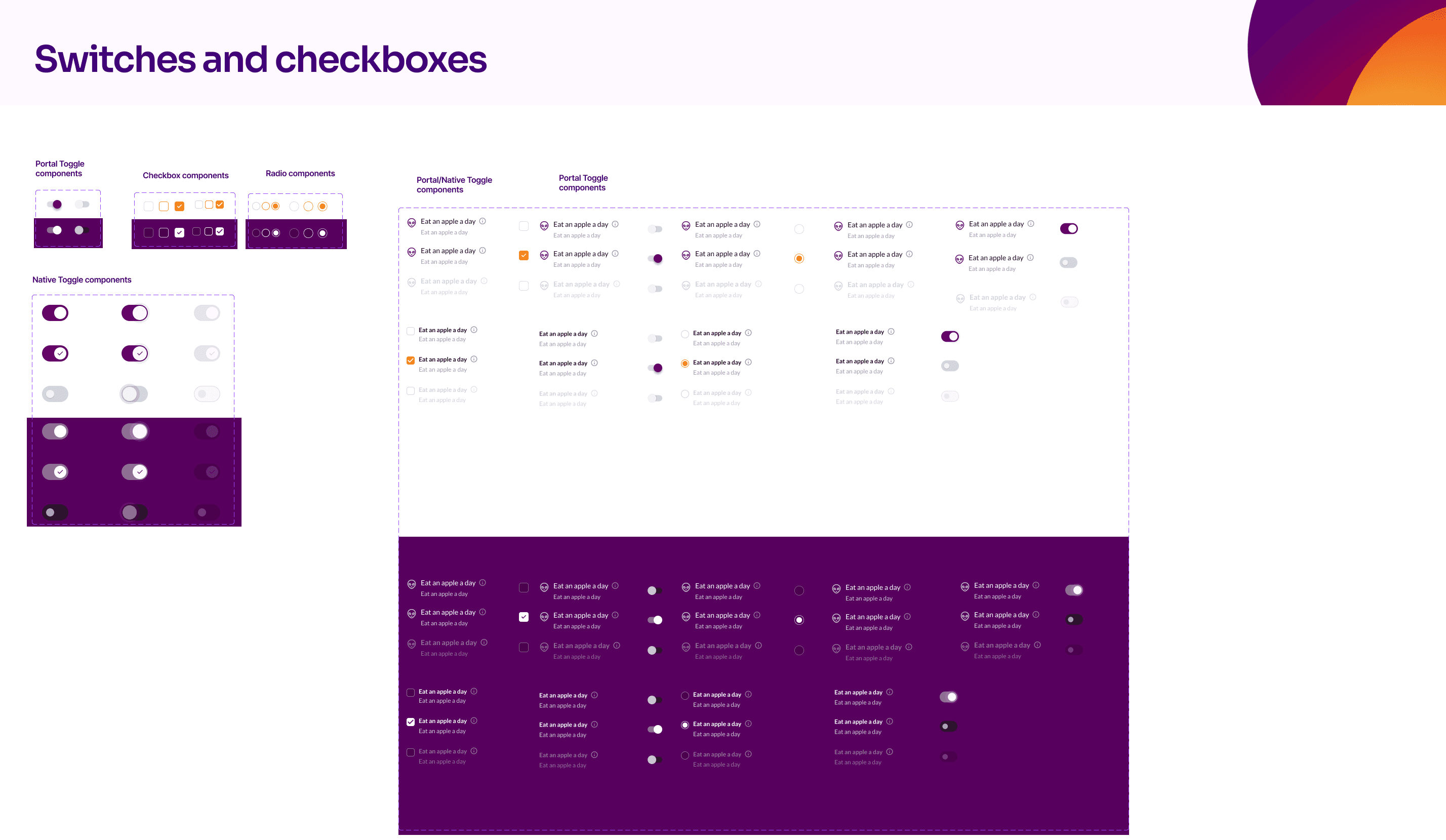
Interactive Elements: Date pickers, switches, checkboxes, tags, chips.
Problem statement
Lack of visual consistency across mobile and web platforms.
Inconsistent assets leading to redundant work and inefficiencies.
Developers and designers had no single source of truth for UI components.
Design and development processes were slow due to repeated decision-making on basic UI elements.
Impacts & Results
The implementation of the NewU Design System had significant positive effects on both design and development processes:
50% faster design process by eliminating repetitive UI decisions.
Improved development speed by providing a structured, ready-to-use component library.
Enhanced UI consistency across web and mobile platforms.
Reduced dependency on designers for minor UI clarifications, enabling developers to work more autonomously.


Conclusion
By introducing a structured design system, NewU now benefits from a consistent, scalable, and efficient approach to UI design and development. This system not only enhances the user experience but also optimizes collaboration between teams.